Total Payroll Jobs(May, 2003, emphasis in the orginal.)
May 2000 - 131.9 million.
May 2001 - 132.2 million.
May 2002 - 130.3 million.
May 2003 - 129.8 million.
May 2004 - 131.4 million.
May 2005 - 133.4 million.
Dec 2005 - 134.5 million.
My response? The figures are impressive---Not! The figures show just how bad the Bush Administration's stewardship has been.
On the chart, there are 31 months shown after May of 2003. In that period, the average monthly increase in jobs was over 151,000. What does this figure mean?
First, the economy needs to add somewhere between 135,000 and 150,000 jobs just to "stay even." That is, the total number of working Americans has to increase by that amount merely to keep up with a growing population. Thus, even in the limited period selected, job growth is merely treading water.
Second, it means that Bush comes in a distant second to Bill Clinton. During the 96 months of the Clinton Administration (measuring the statistics from March of 1993 to March of 2001), the country added, on average, over 235,000 jobs a month. That is, with a smaller population, Cinton did more than 55% better, on average, in each and every month of his administration than Bush did in the best partial slice of his administration.
Let's go one step further. Look at the best slice shown by the chart, May, 2004 to May, 2005. It shows job increases to average only 167,000 per month. (In the last 7 month slice shown, job grown falls to the low 150,000 average. Again, back to treading water.)
Of course, we could take the Bush Administration's performance as a whole, with a average monthly average increase in jobs of just over 38,000. But I doubt that PoliPundit wants to go there.
Here's a chart, created by the Bureau of Labor Statistics website, on the total number of non-farm payroll jobs from 1993 to 2005:
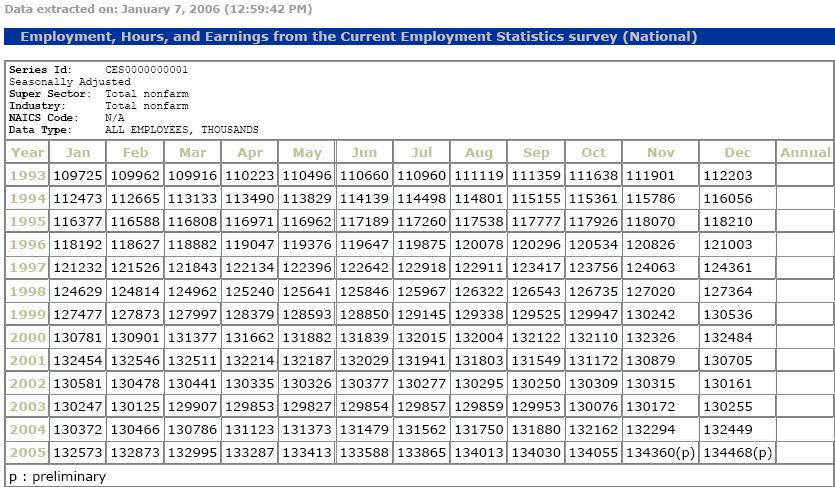 (Click image to enlarge.)
As a graph, the chart looks like this:
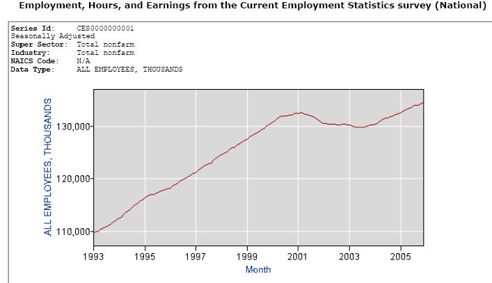
(Again, click image to enlarge.)
Analysing the statistics in another way, the total number of Americans working increased by over 20.5% during the Clinton Administration, an average 0.213% monthly increase. During the first 54 months of the Bush Administration, the increase has been a paltry 1.5%, or an average monthly 0.028% increase. Even looking at the limited time period that PoliPundit points to, the average monthly percentage increase is only 0.116%, or significantly less than the Clinton Administration's 96 month average percentage increase.
Update
Today (January 9, 2006), Kleinrock (subscription required) reported that:
Citing the 108,000 new jobs created last month as evidence that tax relief bolsters the economy, President Bush on January 6th blasted congressional Democrats during his speech before the Economic Club of Chicago for wanting to stop all tax cutting activity to stem the growth of the deficit.Just one more time: If you create only 108,000 new jobs a month, the economy is losing ground. Daddy Bush and then Bill Clinton raised taxes. The result was the steep upward slant in the graph in the middle of this post.
(By the way, the consensus estimate with respect to the December new jobs figure was about 200,000. My guess is that the 108,000 reported by the BLS is actually low and that either January's number will be much higher or the revised December figure will shoot up, with the final result being that the average of the two months will hit at about the 200,000 estimate.)
3 comments:
My uncle was a research market statistician who taught at the college level. When I was in high school he gave me a little book [still in print] called "How to Lie with Statistics." Using that as a guide, if I wanted to "demonstate" strong recent job growth, I would use the part of the line graph from May 2003 to present, with the starting point being the number of jobs at the beginning of the period, and with the left scale having increments based on a fairly small number of increased jobs. This would create the appearance of a sharp upward growth in jobs during the time period covered by the graph. Of course, I might not do this if I were trying to provide a balanced view of the job growth for this period in historical context.
Interesting that Levine uses the lower non-farm payroll jobs as his basis for bashing W and ignores the higher holdhold jobs numbers, which include self-employed persons. Would love to hear Levine's explanation as to why unemployment remains at almost historically low levels even (gasp) during W's administration. Hint: saying people have given up searching for a job is not the answer. When Levine says that between 130 and 150 thousand "jobs" are needed to sustain growth (based on rising population), is that only non-farm payroll jobs? (I suspect not.) Juxtaposing the number of "jobs" necessary to sustain "stay even" with non-farm payroll jobs, instead of household jobs (or all jobs) is not a valid comparison (apples and oranges).
The reason that I used the non-farm payroll jobs statistics was that I was commenting on a blog posting that had touted the alleged success of the tax cut by pointing to the non-farm payroll jobs statistics. Stated somewhat differently, I was merely comparing Clinton apples to the rotten, mealy Bush II apples served up by PoliPundit.
As to the overall unemployment figure, it seems clear that the percentages have remained low because the number of workers looking for jobs has not risen as quickly as the increase in population would seem to dictate. There are likely a number of reasons for this, one of which is that many of the unemployed are not included in the denominator.
Post a Comment